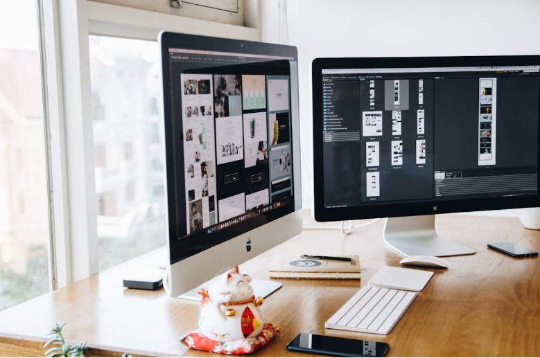
What is the first thing someone notices when landing on a webpage or app? It is not the words. It is the appearance. Colours, images, and layout immediately strike the eye before anything is read.
Most people decide within a few seconds whether they will stay or leave. That decision is often shaped by design alone. Whether it is a social media profile, an online store, or a music app, how things look and feel makes a critical difference.
Good design is not only about beauty. It shapes what someone thinks and feels instantly. When layout, graphics, and details work together, they do more than decorate a page. They draw people in and create a lasting impression.
Graphics: Visuals that Speak Quickly
Visuals are among the strongest tools in digital design. They do not need to be elaborate to be effective. What truly matters is clarity, relevance, and comfort for the eyes.
Graphics explain concepts without the need for lengthy text. A well-chosen image or icon can show what a section is about, set a mood, or highlight an action. Quick-loading and high-quality visuals also help establish trustworthiness.
Consider the Dead or Alive II slot game as an example. From the beginning, its bold design and gritty Western theme stand out. Before gameplay begins, the look and atmosphere suggest what kind of experience the user can expect. This instant message leaves a strong impression and encourages engagement.
Entertainment platforms rely heavily on thumbnails for similar reasons. A good thumbnail sparks curiosity without giving everything away. When users scroll quickly, the right graphic invites them to stop and pay attention.
Layout: Structure Shapes Perception
People tend to scan before they read. A well-structured layout guides the eyes and helps visitors find information quickly. If navigation feels confusing, they are more likely to leave.
The layout serves as the skeleton of a digital space. When it is clean and clear, everything flows. Sections are easy to identify, headings stand out, and nothing feels cramped.
Spacing is also essential. Generous white space reduces stress and prevents clutter. Balanced layouts often hold attention longer in personal bios or on homepages. Navigation is smoother when users do not have to search for what they need. This simplicity transforms curiosity into engagement within moments.
Design Elements: The Small Details That Matter
Every element of a design contributes to the overall experience. Fonts, buttons, colours, and animations may appear minor, but shape how users interact with a digital space.
Fonts should balance style with readability. Clear and consistent typography makes content easy to follow and keeps pages looking professional. If fonts are too complex or inconsistent, users may lose interest.
Buttons also need attention. They should be visible and easy to use without overwhelming the page. When buttons are intuitive and responsive, they improve trust and create a polished experience.
Colour schemes play an equally important role. Bright colours highlight points of focus, while softer tones create calm and balance. The goal is to guide attention naturally without competing with the content.
When subtle, animations provide useful feedback. For example, a light movement when hovering over a button can signal interactivity without being distracting. These small touches add personality while keeping the design functional.
First Impressions and Trust
People are more likely to trust what looks professional. Even if the content is strong, a page that appears broken or outdated risks losing credibility. For digital spaces aiming to retain visitors, that first impression is vital.
A strong design suggests reliability. Users are more inclined to remain and explore when a layout feels modern and organised. This principle applies to all digital spaces, from job applications to music streaming services.
Personal bios also benefit from strong design. Many users may skip it without reading if a profile looks cluttered or poorly structured. On the other hand, when the visuals are clean and the layout is tidy, the content is taken more seriously.
Entertainment sites demonstrate this well. Their design goes beyond fun and is carefully planned. Clear thumbnails, smooth transitions, and consistent branding combine to keep users engaged. This type of experience encourages repeat visits and longer browsing sessions.
Final Words
How a page looks in the first few seconds influences everything that follows. Strong design captures attention, guides choices, and builds trust before reading words. It is more than a backdrop. It is part of the message itself.
A reliable product photo editing company provides specialized image enhancement solutions for ecommerce brands, retailers, and photographers. Their services often include background cleanup, image retouching, color adjustments, and optimization for online marketplaces. Professional editing helps businesses maintain a consistent brand image while presenting products in the best possible way.
Even minor adjustments can make a significant difference. A better image, improved spacing, or a cleaner font can all improve users’ feelings. Next time you scroll, consider what makes you stop and pay attention. That is the power of first impressions in action.