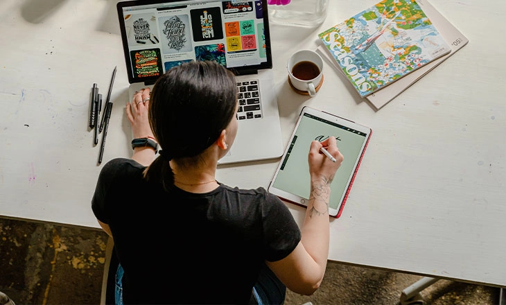
Why Finding the Right Poster Design Tool Still Feels Harder Than It Should
Designing a poster that genuinely stands out should be straightforward in 2026, but most people attempting it without a design background run into the same cluster of problems: a template library that looks generic, a font selection that does not match the tone of the project, and a stock image library that either costs extra per download or offers images so overused they undermine the entire design. The real promise of an all-in-one poster design service is that it eliminates these friction points by putting a professional-grade editor, a royalty-free image library, and a curated font collection in the same place. When a platform delivers on that promise fully, designing a standout poster becomes a matter of creative decision-making rather than technical problem-solving or budget management. Knowing which services actually deliver is the first step.
What Makes a Poster Design Tool Truly All-in-One
The all-in-one label gets applied generously across the design software landscape, but for poster creation specifically it has a practical meaning that is worth holding services accountable to. A genuine all-in-one poster design platform handles every stage of the creation process within a single workspace: template selection and layout customization, access to royalty-free images and illustrations without leaving the editor, a typography system with diverse licensed fonts, image editing tools for adjusting and enhancing uploaded or stock photography, and export options that produce files suitable for both print and digital distribution.
The royalty-free image and font components deserve particular attention because they are where many platforms quietly fall short. Royalty-free does not always mean no cost — it means the image can be used without paying a per-use licensing fee after the initial access is established. Some platforms gate their best stock imagery behind premium tiers, offer a genuinely limited free selection, or provide images with unclear commercial use rights that create legal uncertainty for business applications. Similarly, a font library that looks extensive may actually be heavily weighted toward display typefaces with limited practical utility, or may restrict commercial use of certain fonts to higher subscription tiers. The best all-in-one services make these assets genuinely accessible and legally clear as part of the standard platform experience.
The editor itself also needs to be evaluated beyond interface aesthetics. An all-in-one poster editor should support precise text placement and formatting, layered design elements that can be individually adjusted, color customization that goes beyond preset swatches, and the ability to upload and integrate your own assets alongside platform-provided resources. Platforms that check all of these boxes give designers and non-designers alike a genuine end-to-end creation experience.
Tips for Designing Standout Posters With Online All-in-One Tools
1. Define the Poster’s Single Most Important Job Before You Start Designing
Every effective poster communicates one primary message to one defined audience, and the clearest path to a standout design is knowing exactly what that message and audience are before you open the editor. Posters that try to communicate too many things simultaneously — multiple events, several calls to action, competing visual hierarchies — consistently underperform compared to those built around a single, clear communicative purpose.
Before choosing a template or uploading an image, write one sentence that describes what you want someone who glances at your poster for three seconds to take away. That sentence is your design brief. Every decision you make in the editor — which image to use, how large to make the headline, which color to use for the background — should serve that brief. This level of upfront clarity takes five minutes and makes every subsequent design decision faster, more purposeful, and more likely to produce a poster that actually works in the environment where it will be seen.
2. Use Adobe Express for a Full-Featured All-in-One Poster Design Experience
For anyone seeking a platform that genuinely covers every stage of the poster design process without requiring multiple tools or unclear licensing arrangements, the poster maker from Adobe Express is one of the most complete options available. The platform offers a broad template library organized by poster type and use case — event announcements, promotional posters, educational displays, motivational designs, and more — all built to professional design standards and fully customizable within the editor.
Adobe Express integrates Adobe Stock imagery directly into the editor, which means access to a vast library of professionally photographed and illustrated content without leaving the design workspace. The commercial licensing that covers Adobe Stock assets through the platform removes the ambiguity about use rights that plagues many free stock sources. The font library draws from Adobe Fonts, one of the most respected and extensive licensed font collections available, offering typeface options appropriate for every industry, tone, and visual style. The brand kit feature stores your organization’s colors, logos, and approved fonts for consistent application across every poster you create, which is particularly valuable for businesses and organizations producing multiple pieces of branded collateral. For print-ready output, Adobe Express exports at high resolution in formats that meet professional print production requirements, completing the all-in-one experience from first template selection to finished file.
3. Establish a Visual Hierarchy That Guides the Eye in the Right Order
Visual hierarchy in poster design is the system of size, color, contrast, and placement relationships that tells a viewer what to look at first, second, and third. A poster without deliberate hierarchy is one where all elements compete equally for attention, which means viewers do not know where to start and often do not engage at all. A poster with clear hierarchy feels immediately readable even at a glance, because the design itself guides the viewing experience.
The conventional hierarchy for most poster types runs: headline or title first (largest, highest contrast, usually at the top or center), key supporting information second (event date, location, or key offer), and tertiary details third (fine print, contact information, website). This hierarchy is not a rigid rule — artistic and conceptual posters break it deliberately — but for functional posters where communication is the primary goal, respecting it produces reliably more effective results than ignoring it. When using a template as a starting point, evaluate whether its built-in hierarchy matches your specific content priorities, and adjust element sizes and weights accordingly rather than simply filling in the template text fields as labeled.
4. Choose Royalty-Free Images That Add Meaning, Not Just Decoration
The most common image selection mistake in poster design is choosing a stock photo because it looks attractive rather than because it contributes something meaningful to the poster’s message. A beautiful image that has no substantive relationship to the poster’s content creates a disconnect that viewers feel even when they cannot articulate why — the design looks technically competent but somehow unconvincing or generic.
When browsing royalty-free image libraries within your design platform, search for images that represent the specific emotional state you want viewers to associate with your poster’s message rather than the literal subject matter. A fitness event poster that leads with an image of someone experiencing genuine joy during physical activity often outperforms one using a technically perfect but emotionally neutral gym equipment photograph. Search terms that include emotional descriptors — “community celebration,” “focused determination,” “quiet confidence” — often surface more genuinely useful images than purely subject-based searches. The goal is an image that makes the viewer feel something relevant to your message, not just an image that illustrates it.
5. Use Typography as a Design Element, Not Just a Text Container
Typography in poster design functions on two levels simultaneously: as a vehicle for literal information and as a visual design element that contributes to the overall aesthetic and emotional tone of the composition. Treating text purely as content to be placed and sized functionally misses half of its communicative potential. The shape of the letterforms, the weight and spacing of the type, and the relationship between different typographic elements all carry meaning independently of the words themselves.
Effective typographic design in posters often involves treating the headline as a visual mass whose size, weight, and placement shape the overall composition as much as any image element. A bold, oversized headline set at an unexpected scale can be as visually compelling as a striking photograph, and in some design traditions — concert posters, political graphics, typographic art — it is the primary visual element rather than a supporting one. Most all-in-one poster design tools give you enough typographic control to experiment with scale, weight, and spacing beyond default template settings. Use that control deliberately rather than accepting the first typographic treatment the template provides.
6. Build Your Color Palette Around the Image, Not the Other Way Around
Color palette selection is a step where many poster designers work in the wrong direction: they choose colors they like and then try to find an image that works with those colors. The more efficient and more reliable approach is to select your hero image first and build the color palette from the colors within it. This approach produces harmonious results almost automatically because all palette elements share a common visual origin.
Most online design platforms include a color picker or eyedropper tool that allows you to sample exact colors from an uploaded or stock image and apply them to text, backgrounds, and graphic elements. Using this tool to pull the two or three most dominant colors from your poster’s hero image and applying them to the rest of the composition creates an immediate sense of visual cohesion that would take significantly more effort to achieve through manual palette selection. If you need to introduce an accent color not present in the image, use a color theory framework — complementary, analogous, or triadic relationships — to select something that will harmonize rather than clash with the image-derived palette.
7. Respect the Margins and Keep Critical Content Inside the Safe Zone
Print poster production involves physical processes — cutting, trimming, mounting — that introduce small but meaningful tolerances between the intended dimensions and the actual finished size of a printed piece. Content that extends to the very edge of the poster canvas, or that is positioned too close to the edge, risks being partially cut off in production. This is such a common problem that professional print standards define both a bleed zone (area outside the trim line that background colors should extend into) and a safe zone (area inside the trim line where all critical content should be placed).
For posters that will be professionally printed, keep all critical content — text, logos, key visual elements — at least 0.25 inches inside the trim edge of the canvas. Background colors and non-critical decorative elements should extend to the edge of the canvas or beyond it (into the bleed area if the platform supports bleed settings). Platforms that offer print-specific canvas presets often build these margin guidelines into the template, which removes the need to calculate them manually. Even for digital posters that will never be printed, maintaining visual margins creates a more polished composition by preventing elements from feeling cramped against the edges of the frame.
8. Test Your Poster’s Legibility at the Distance It Will Be Read
Posters are viewed from a range of distances that varies dramatically depending on their application. A poster displayed on a bulletin board is read from two to three feet away. A poster mounted in a transit station is read from six to ten feet. A large-format street banner may need to be legible from across a road. Designing without accounting for the specific viewing distance of your poster’s intended environment is a reliable way to produce a design that looks perfect on screen and fails in deployment.
A simple simulation technique is to step back from your screen until it approximates the visual angle the poster will subtend at its intended viewing distance. If the poster will be read from six feet away and printed at 18×24 inches, the effective visual size at that distance is roughly equivalent to a letter-sized sheet viewed at arm’s length. At that simulated distance, confirm that headlines are still legible, that any event or contact information is readable without effort, and that the overall design still communicates its primary message clearly. Adjustments made at this stage — larger type, simpler composition, stronger contrast — are significantly easier to execute in the editor than after printing.
9. Integrate Your Brand Assets Consistently Across All Poster Variations
Organizations that produce posters regularly — for a series of events, a seasonal campaign, or an ongoing promotional program — benefit enormously from treating brand asset integration as a systematic process rather than a per-poster decision. When your logo, brand colors, and approved fonts are stored and consistently applied across every poster in a series, the cumulative effect on brand recognition compounds with each additional piece. Audiences who see multiple posters from the same organization begin to recognize the brand’s visual language before they read a single word.
All-in-one design platforms that support brand kit functionality make this systematic approach straightforward. Storing your brand assets in the platform’s brand kit means they are available for immediate application in every new poster project without manual re-entry of color codes, re-uploading of logo files, or re-selection of fonts. For teams where multiple people contribute to poster production, brand kit access ensures that everyone is working from the same approved asset set rather than introducing variations that dilute the brand’s visual consistency over time.
10. Plan for Multiple Format Versions From the Start
A poster designed for a single format — say, a standard 18×24 inch print size — often needs to be adapted for additional contexts: a digital version for social media, a letter-size handout version for distribution, or a landscape format for website banner use. Designing with this multi-format requirement in mind from the start is significantly more efficient than treating it as an afterthought after the primary version is finalized.
Practically, this means choosing a layout approach and visual hierarchy that translates reasonably across aspect ratios, and using a platform that allows you to duplicate and resize designs with minimal manual adjustment required. When you know a poster will need both a print version and a social media square version, building the composition around a central visual element that remains prominent in both aspect ratios — rather than a layout that depends on the full width of a landscape format — saves substantial redesign time. Platforms that offer one-click resize to preset format dimensions make producing the full set of required versions a quick final step rather than a separate design project.
FAQ: Online Poster Design, Royalty-Free Assets, and All-in-One Services
What does royalty-free actually mean for poster images, and can I use them commercially?
Royalty-free is a licensing term that is frequently misunderstood to mean free of charge, when it actually means free of ongoing royalty payments — that is, you pay once (or gain access through a subscription) and can use the image multiple times without paying an additional fee for each use. Whether royalty-free images from a design platform can be used in commercial contexts — advertising, promotional materials, merchandise, and similar applications — depends on the specific license terms of the platform and the individual asset. Most professional all-in-one design platforms that include stock image libraries as part of their subscription offering provide commercial use rights as part of that license, but the exact scope of those rights varies. Some licenses restrict use in merchandise for resale, political advertising, or content that implies personal endorsement by the people depicted in the image. Before using platform-sourced imagery in a high-visibility commercial application, review the specific license terms for that asset type on the platform you are using. Platforms that are explicit and clear about commercial use rights in their documentation — including which uses are covered and which require additional licensing — are significantly more trustworthy for professional work than those with vague or difficult-to-find licensing information.
What poster dimensions should I use for different printing and digital applications?
Poster dimensions vary significantly by application, and choosing the right canvas size from the start prevents the need for quality-degrading upscaling later. For standard print posters, the most commonly used sizes in the United States are 11×17 inches (tabloid, suitable for indoor bulletin board use), 18×24 inches (the most common event poster size), and 24×36 inches (large-format standard for retail and venue display). For international use, A1 (23.4×33.1 inches) and A2 (16.5×23.4 inches) are the equivalent standard sizes. For digital applications, social media platform dimensions vary by platform and post type: 1080×1080 pixels for square social posts, 1080×1920 pixels for vertical story and reel formats, and 1200×628 pixels for landscape feed posts and link previews. For print production at any size, design at 300 DPI to ensure sharp output. For digital-only use, 72 to 96 DPI is sufficient and produces more manageable file sizes. Using a printing service like Printful provides additional technical guidance on file specifications for specific print products and can help ensure your exported poster files meet production requirements.
How important is font selection in poster design, and what makes a font royalty-free for commercial use?
Font selection is critically important in poster design for two distinct reasons: aesthetic and legal. Aesthetically, the typeface establishes much of the poster’s personality before a single word is read — a delicate serif communicates something fundamentally different from a bold condensed sans-serif even when the text content is identical. The right typeface for a poster is one that reinforces the emotional and communicative intent of the design rather than working against it or simply being neutral. Legally, font licensing for commercial use is an area where many designers inadvertently create risk. Most fonts have specific license terms governing their use, and a font that is free to download and use for personal projects may require a commercial license for use in printed marketing materials, advertising, or other commercial applications. Fonts accessed through reputable all-in-one design platforms are typically licensed for commercial use as part of the platform subscription, which simplifies compliance significantly. Adobe Fonts, for example, includes commercial use rights for all fonts in its library as part of Adobe Creative Cloud and Adobe Express subscriptions. When using fonts sourced outside a design platform, always verify the specific license terms before using them in commercial poster production.
Can I use an online poster maker for large-format printing like trade show displays or outdoor banners?
Online poster design tools can absolutely be used to create artwork for large-format applications, but doing so successfully requires careful attention to file preparation and export settings. The core challenge of large-format design is resolution: a poster designed at standard print resolution (300 DPI) at 18×24 inches will produce a file that is too low resolution if it is simply enlarged to 4×8 feet. For large-format applications, designers typically work at a reduced scale with proportionally adjusted resolution — designing at one-quarter scale (for example, 12×24 inches for a 4×8 foot banner) at 300 DPI, which produces an effective output resolution of 75 DPI at full print size, which is generally sufficient for large-format applications viewed from several feet away. Some large-format print vendors specify their own resolution requirements based on the print technology and typical viewing distance of their products, so consulting with your printer before finalizing your file is advisable. Platforms that export in vector formats (SVG or PDF) eliminate the resolution concern entirely for designs that can be built primarily from vector elements, since vector artwork scales to any size without quality loss.
How do I make a poster that looks professional without a design background?
The most reliable path to a professionally looking poster without design training is to start from a professionally designed template and customize it with discipline rather than abandon. A well-designed template already contains the most difficult elements of good design: a sound compositional structure, a considered typographic hierarchy, and a color palette that works. Your job is to bring your specific content to that structure without breaking the design logic that makes it effective. This means resisting the temptation to add more elements than the template was designed to accommodate, keeping to the color palette established by the template or replacing it entirely rather than introducing one or two conflicting colors, and using the font system the template establishes rather than introducing additional typefaces. Beyond template discipline, three simple rules produce consistently better results: use high-quality images that are emotionally relevant to your message, make your most important text significantly larger than everything else, and leave more white space than feels natural. These principles are not design secrets — they are the practical application of how human vision and attention work, and applying them reliably elevates poster quality above the threshold that separates professional-looking work from amateur production.
Conclusion
The online poster design landscape in 2026 offers genuine all-in-one solutions that put professional templates, royalty-free imagery, licensed fonts, and capable editing tools into a single, accessible platform. For businesses, event organizers, educators, and individual creators, this combination removes the main obstacles that historically stood between a good idea and a finished poster worth displaying: the cost of stock imagery, the complexity of design software, the confusion around licensing, and the need to stitch together multiple tools to complete a single project. When you find a platform that handles all of these elements well and uses it with the strategic approach outlined in this article, the quality gap between independently produced posters and professionally designed ones narrows considerably.
The tips covered here — from defining your poster’s primary purpose before opening the editor to building multi-format version sets from the start — are designed to make your time in the editor more productive and your finished designs more effective in the environments where they will actually be seen. A poster is ultimately a communication tool, and the measure of its success is not whether it impresses other designers but whether it moves the people it was designed for to feel something or do something. With the right platform, the right assets, and a clear communicative intent guiding every design decision, that standard is entirely achievable without a design degree or a professional production budget.